WAKE UP – CEREAL
PROBLEM
Elderly people were concerned about the packaging of modern cereals which include a lot of characters. childish pictures and bright colours.
SOLUTION
The solution is to come up with a minimilistic design that has a proffesional appearance for seniors.
IMPACT
It may make seniors feel more comfortable to own in their cupboard, collect from the shelves and to use in the morning.
BRAND NAME
“Wake up Cereal” because it’s a morning routine for everyone where we simply wake up and the majority eat so it was a no brainer to choose proceed with this eye catchy mimilistic name”.
We have come up with the logo design and tag line in three designs showing case.
DESIGN CONCEPTS
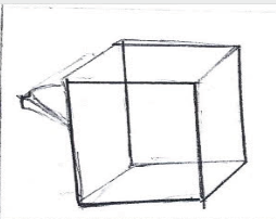
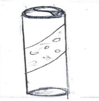
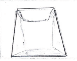
THREE CONCEPT SKETCHES
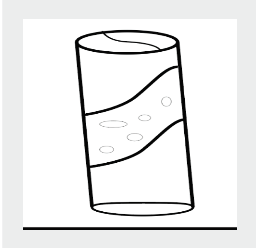
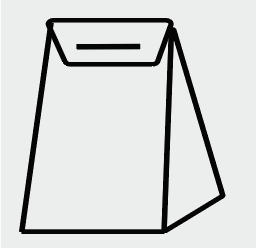
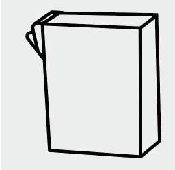
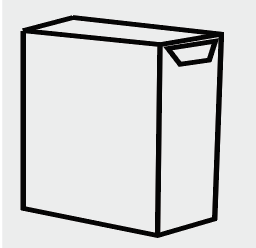
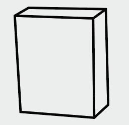
The sketch consists of rectangular, cylinder and triangular shapes.
DIGITAL DEVELOPMENT
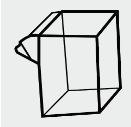
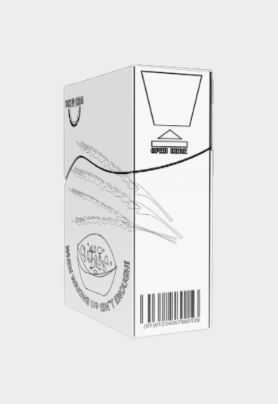
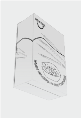
Converting from sketch to digital was done through illustrator. First design is a rectangle shape with a flip open shute. Second design is a cylinder with a twist open top. Third design is a flip open bag concept
CHOSEN CONCEPT
Concepts were made using recyclable
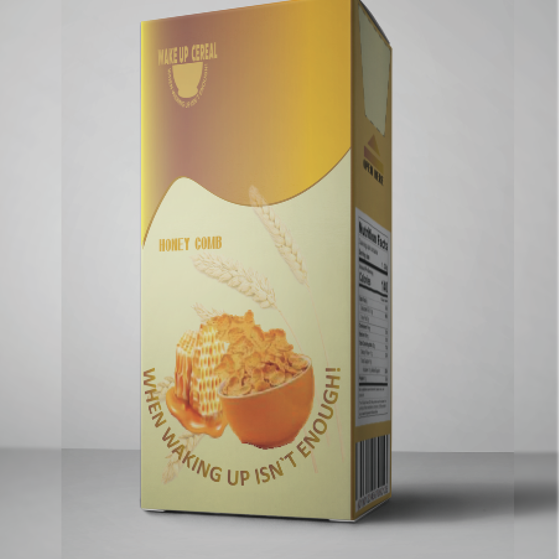
cardboard and the ideal chosen concept was the rectangle design with a pull tp open flap that easily pushes to close. This is user friendly, competes with competitors and is minimalistic.
DEILINE
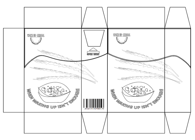
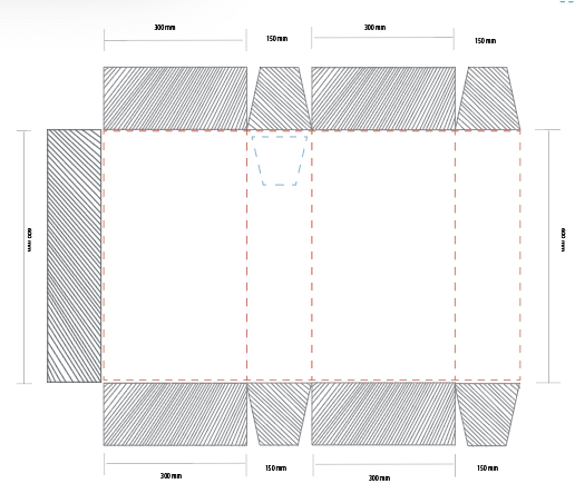
The packaging has been created using illustrator ensuring the bleed, fold lines and cut lines are accurate in measurement for easy production for mass producing.
The box itself will have a combination of text, colour and elements.
PROTOTYPE DESIGN
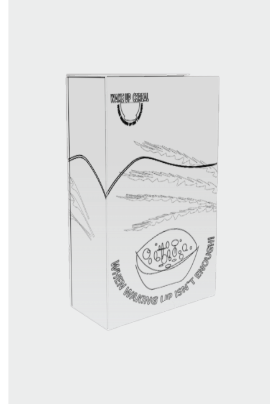
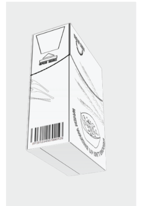
Show casing the packaging how looks to the human eye.
This helps as we can determine if we should increase or decrease any measurements for a more appealing look or make changes to any of the imagery or text.
DIGITAL DEVELOPMENT
COLOUR PALATTE
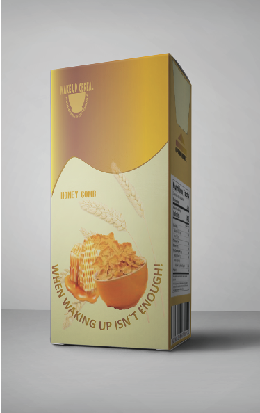
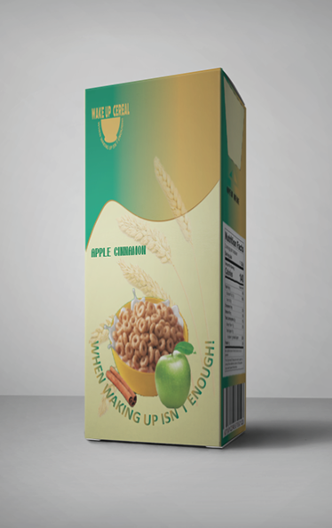
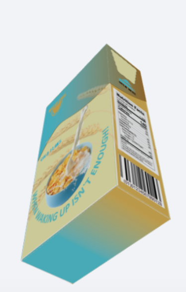
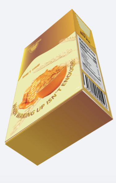
The colours we have chosen are simple with a combination of similar colours used for the purpose of demonstrating cereal flavours in the box.
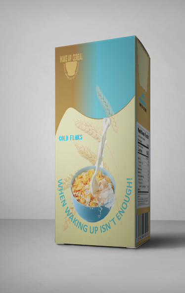
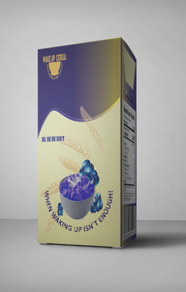
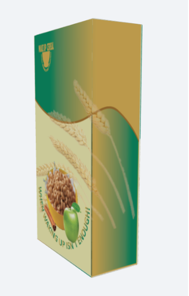
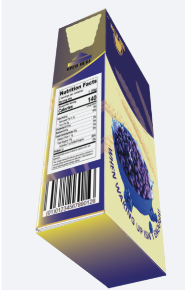
FINISHED PRODUCT
HONEY COMB
APPLE & CINNAMON
GOLD FLAKES
BLUEBERRY
FINISHED PRODUCT PACKAGING IN
DIFFERENT ANGLES
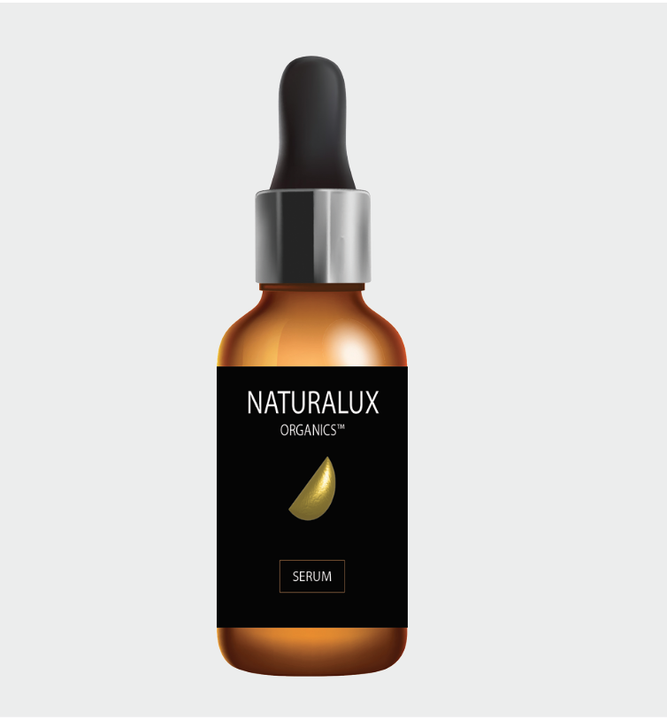
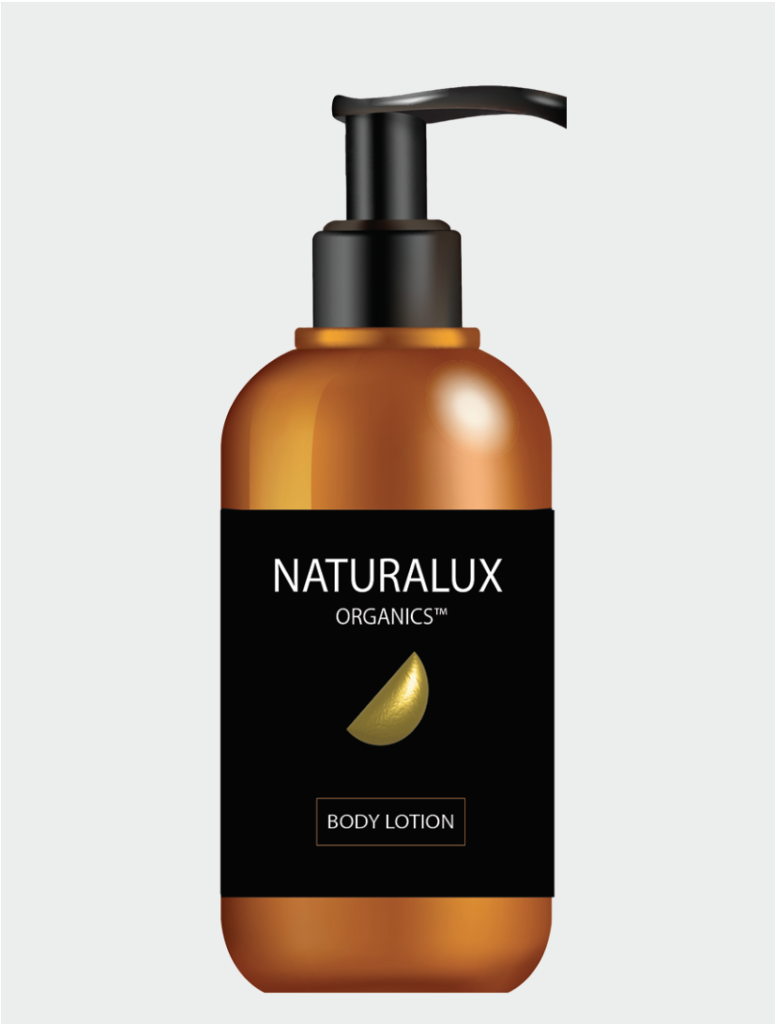
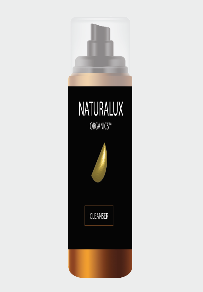
NATURALUX SKIN
CARE PRODUCTS
BACKGROUND
To make a minimalist packaging design for a Nutralux skin care product range.
SOLUTION
Solution is to come up with very simple and clean minimalist packaging design for a Nutralux skin care product.
IMPACT
Bringing organic ingredients to people from reliable sources. Packaging is designed to be simple, bringing immediate awareness it’s organic.
There is a serum and cleanser and body lotion for the Naturalux skincare range.
