BACKGROUND
THE HUB Community centre was a mental asylum for the insane and has been out of service for many years located at 209 Taralga Rd, Goulburn, NSW.
The sites history dates back until late 1800s and has become an iconic landmark for the town of Goulburn. The reason for the closing of the physicatric hospital was due to misconduct towards patients and since then many proposals have been made by interested investors however no action was ever accomplished.
SOLUTIONS
We aim to bring a service of family and educational activites to the local community. Some of our new designs have been inspired by the buildings historical design.
Our name and logo design was influenced by the interior designs and colours of the buildings former design and we have managed to create for the community a modern touch.
LOGO SKETCH
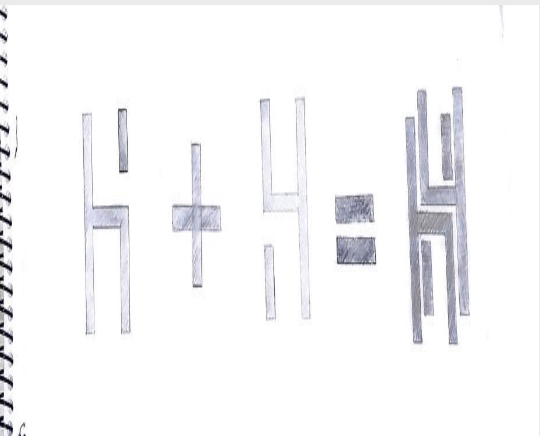
Our name and logo design was influenced by the interior designs from the building, the logo is typographical simply combining the “H” letters. This is to create a modern touch for the community.
FINAL LOGO SKETCH
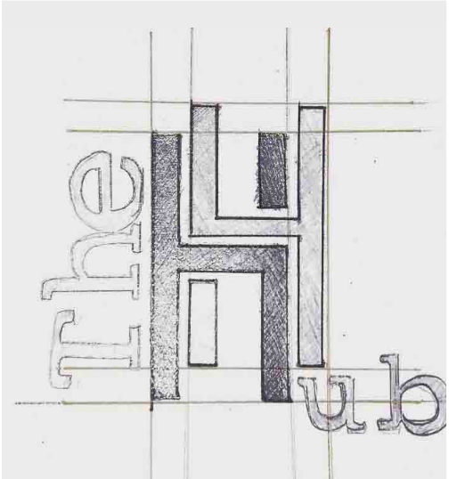
Moving the letter “H” to the centre of the logo to fulfill the word “Hub” and the word “The” on a 90 degree angle to the left. Our sketch is now complete with a modern design.
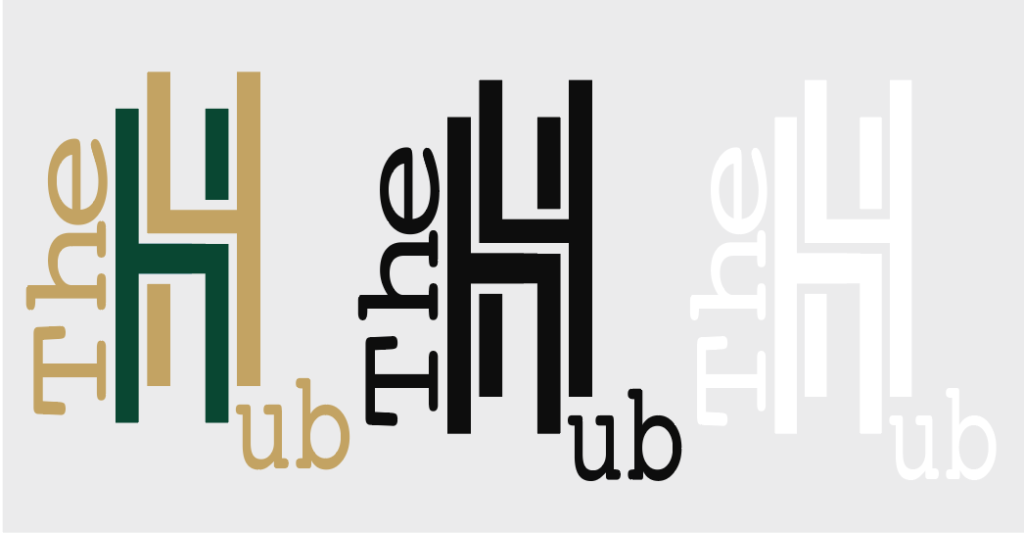
PRIMARY LOGO
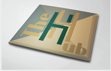
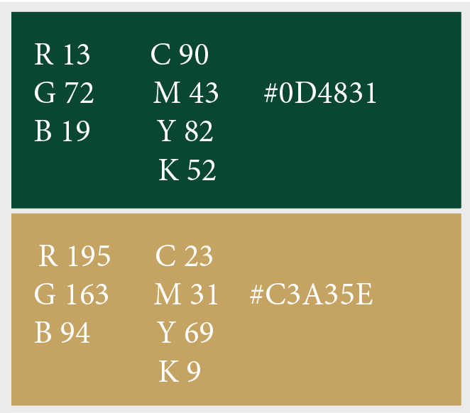
The Hub logo is typographical and displays three different colours.The primary logo colour is dark green and dark yellow.
Depending on the background determines which colour logo we will use.
SECONDARY LOGO IN BLACK
As as an option we have a secondary logo available in black that may be used with a white background.
SECONDARY LOGO IN WHITE
“THE HUB” logo in a reversed colour of white this will be used with a black background.
COLOR PALETTE
The colours I have chosen for the logo and design application were inspired by the colours from the sites walls, plants and from old curtain remains in some of the rooms.
The dark green colour is inspired from a curtain we found.
The dark yellow colour is inspired from the plants surrounding the building.
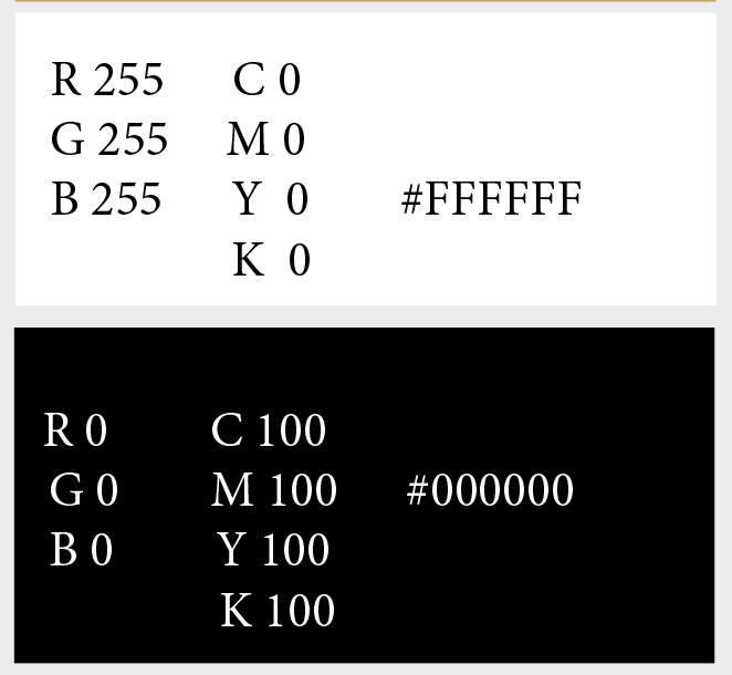
These two colours were used most and I have black and white as an secondary option to my logo.
Brand Pattern
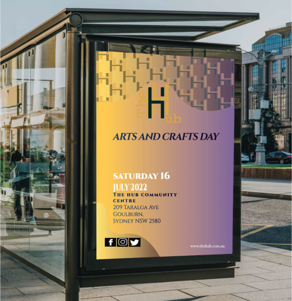
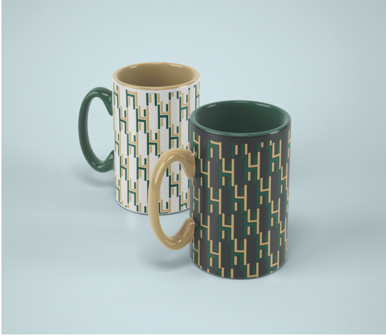
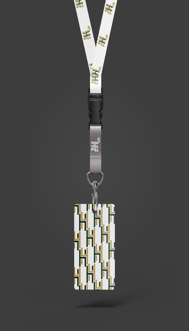
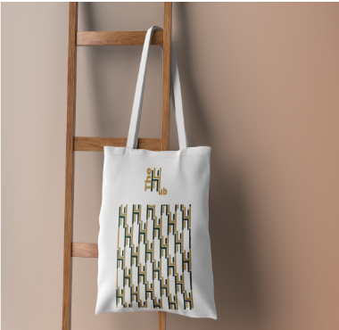
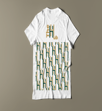
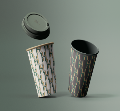
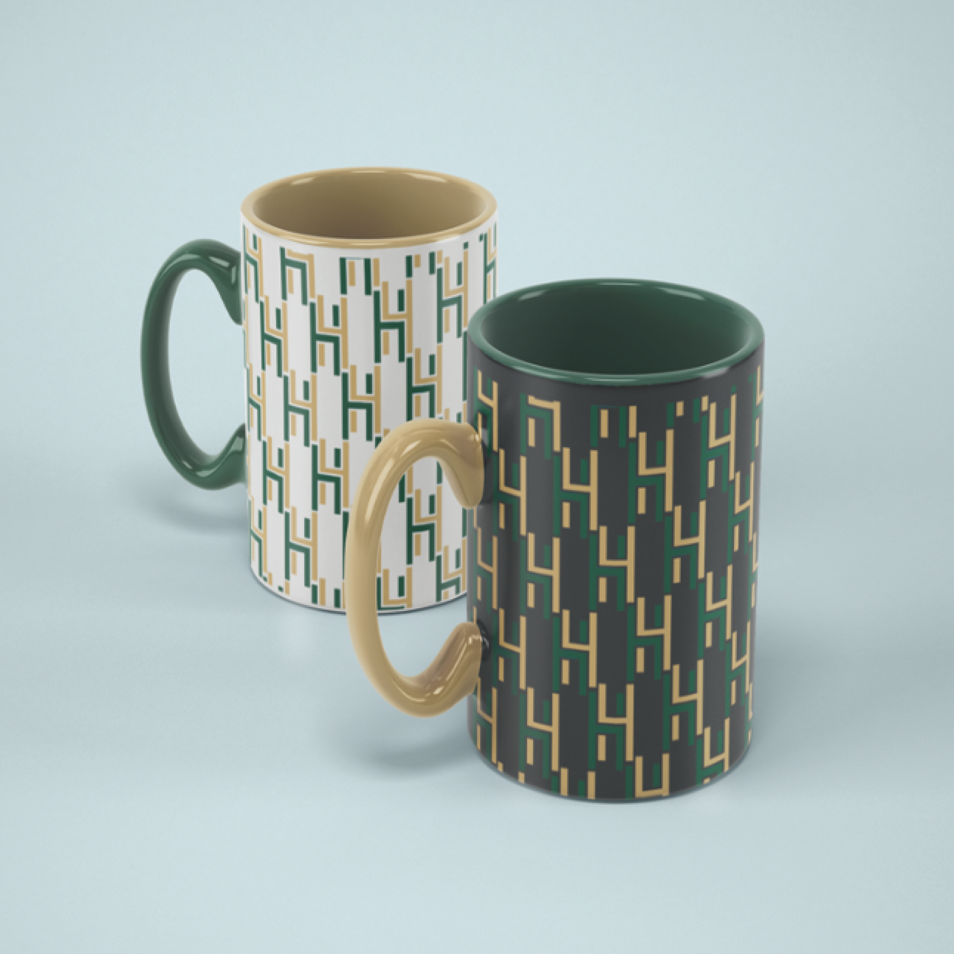
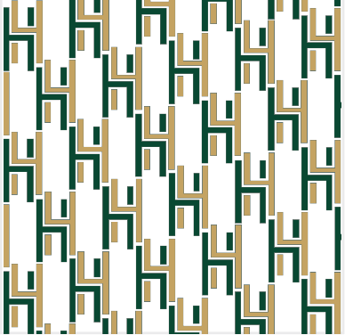
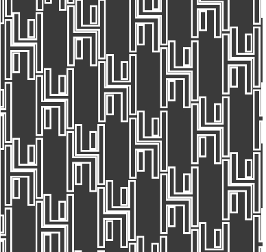
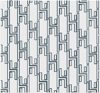
The brand pattern made from the typhographic logo. The patterns will be used to display on the brands merchandise products such as T-shirts, coffee cups and community ID cards. Additionally they will be used in some of the advertising brochers and posters.
POSTER
DESIGN
This poster was designed with the use of a logotype and brand pattern. The curved lines on the top represent THE HUB Community centre’s windows and doors that were made with a lot of round and curve shapes inspired from the buildings winsdows to capture it’s historical feature.
BROCHURE
DESIGN
BACKGROUND
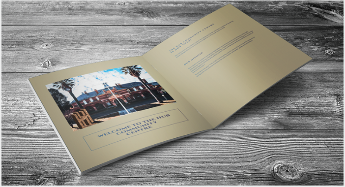
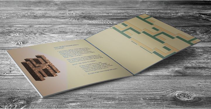
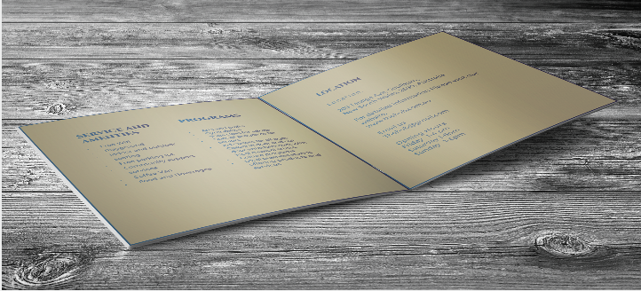
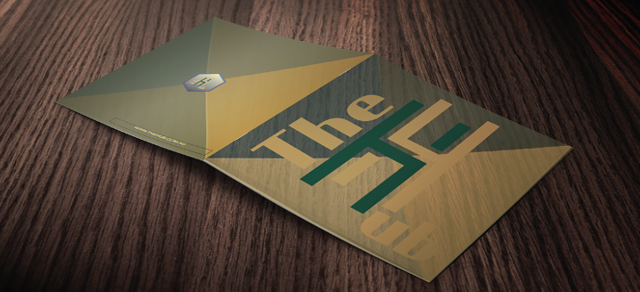
To advertise our recreated location to the community we have designed a brochure showcasing the property, discussing new events taking hold that can be easily given out to community members.
SOLUTIONS
We used the same logo and colour pallet for the brochure on all pages showing all the events, programs and activities for families or tourists.
TYPOGRAPHIC
LAND MARK
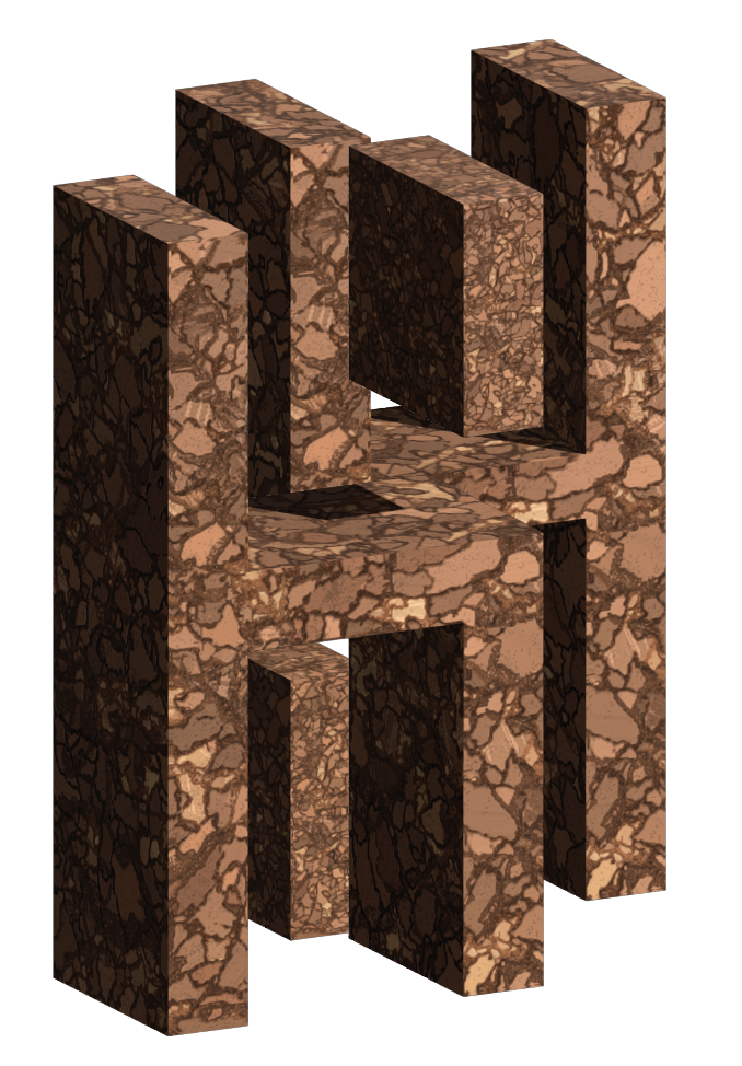
This is the Typohraphic 3D Dimensional Landmark, it represents the letter “H” found in the logo.
We have chosen to create this landmark to be large in size so that it can be easily visable to those at a far distance.
The location of the landmark is in front of THE HUB Community centre.
SIGNAGE/WAYFINDING
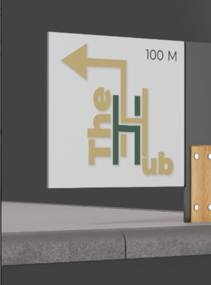
The signage is of a minimilistic design which is simple to read showing the logo of THE HUB Community centre and indicates the distance to the location.
MERCHANDISE
THE HUB Community centre’s merchandise will be visable for visitors, to see upon arival and exiting the building. All merchandise shows our brand pattern that represents THE HUB Community centre.
